Fictional Digital Elevation Model
24 Sep 2020 - zach
Outline
- The Problem: Planetary Terrain Generation
- Software-assisted conworlding
- Procedural terrain
- Tectonics JS
- PIL Images
- Using the Data
- Enter Rasterio
- Data array
- Affine transform
- NoData
- Creating the GeoTIFF
- Results
- Interpolation
- Geopandas
- Results
- Coda
- Acknowledgments
The problem: planetary terrain generation
I have a hobby of worldbuilding. For some time, I have been interested in the most concrete foundation of fictional worlds: physical geography.
Humans are at a serious disadvantage in generating fictional geography. Real-world geography shaped by a number of geological processes that most humans are unaware of. Thus, when humans draw fictional maps by hand, the artifacts are prominent.
Software-assisted conworlding
Since high school, I have recognized the potential of software-assisted conworlding in this process, and for many years I have collected and even created software for this purpose. For constructing languages, I have used many tools from Alex Fink’s Gleb, William Annis’ Lexifer, to Js Bangs’ Phonix. But the area where I have most acutely felt the need for better software is in the production of terrain.
Procedural terrain
From the earliest dungeon crawlers, to No Man’s Sky, and even to Hollywood movies, terrain is a classic problem of procedural generation. Terrain is so important in so many fields of creativity, and has been studied so extensively in the field of computer science, that I gave a presentation on it when I took COM S 437 in Spring 2020.
Generating terrain illuminates a broad division among algorithms for procedural generation: teleological vs ontogenetic. I won’t go into too much detail here (see my presentation above). Basically, teleological algorithms generate content by (at least superficially) simulating the real-life processes that generate the content you’re looking for. For example, a teleological approach to generating terrain would be to simulate deformations from plate tectonics and erosion. In the ontogenetic approach, the idea is to design some ad hoc algorithm that just approximates the content that you want.
The main advantage of ontogenetic algorithms is that they are very easy to write. They require little more than a few advanced mathematical concepts that will be more familiar to software engineers, while teleological algorithms require extensive research in fields well outside the normal comfort zone of mathematically-oriented software engineers. Moreover, they can be much more performant compared with more computationally-intensive teleological solutions.
But while ontogenetic algorithms suffice for a variety of use cases, ontogenetic approaches often fall short of the desired realism for several reasons.
- Ontogenetic algorithms usually work by generating or approximating fractal geometry. This is because terrain often appears to be fractal (indeed, terrain played a major role in the invention of fractal geometry). But terrain is not really fractal. Specifically, terrain does not have the same fractal dimension at all scales. This is because very different geological processes operate at different scales. For example, plate tectonics may determine where the mountains and oceans are, but lakes and hills are often created by glaciers in oscillating ice ages.
- Real-life geological processes create a number of artifacts that ontogenetic algorithms do not generate, such as island chains, rift valleys, back-arc basins, karst landscapes, and more.
- Ontogenetic algorithms often generate artifacts that are unnatural.
Fortunately, some solutions have already been written. In 2012, a Finnish computer science student named Lauri Viitanen wrote a C++ program called PlaTec that superficially simulates plate tectonics to generate planetary-scale features. Unfortunately, it has one serious disadvantage: it only operates on wrapped squares, while real-life plate tectonics operates on spherical planets. For COM S 424, a high-performance computing class I took in Fall 2019, I wrote another C++ program called parallel-world which generates fractal terrain over spherical surfaces using the Midpoint Displacement Algorithm. Importantly, it works by using a cubemap projection, allowing rectangular grids on a spherical surface with minimal distortion. I am currently working on extending PlaTec to work on spherical surfaces using work from parallel-world. But that is a long-term project. (I’ll be sure to post updates on it when I make progress.)
Tectonics JS
In the meantime, I am interested in Carl Davidson’s TectonicsJS, a web application that simulates plate tectonics. Unfortunately its implementation of plate tectonics is not as good as PlaTec’s, and, being implemented entirely single-threaded and in JavaScript for some reason , its performance is abomidable. But TectonicsJS works on a spherical surface, and it even has features for generating prevailing winds, precipitation patterns, and other useful information. Overall, it could be a very useful program.
TectonicsJS can export much of its data in CSV files. Fortunately, these files have column labels indicating that each row represents a sample of height, precipitation, pressure, and other useful data at some geographic point. But it wasn’t at all clear how the surface was sampled. Were the points sampled in an equirectangular fashion, or were they sampled evenly across the spherical surface? Before I could do anything with the data, I had to figure out exactly what it was.
PIL Images
I use Python for experimentation because it is easy to get something working very quickly. My objective was to create a grayscale heightmap based on the points in the file. That way I could get a basic visual picture of what my data represented.
I used the standard csv library to read the file, and used the PIL library to generate the image. The business logic is in makeMap(), which actually reads the data and makes it into a map.
import csv
import pandas
from PIL import Image
import math

# Takes a csv reader and a filename, and returns a PIL image
def makeMap(reader, filename):
# Use Pandas to get the maximum and minimum altitude for flattening data
# Obviously this is a hack.
data = pandas.read_csv(filename, header=0, names=['lat', 'lon', 'alt', 'plate', 'temp', 'rain'])
max = data['alt'].max()
min = data['alt'].min()

# Create image for an equirectangular projection. Every pixel is a degree
# of latitude/longitude, so it is 360 'degrees' wide and 180 'degrees' tall.
im = Image.new('L', (360, 180))
px = im.load() # Get a PixelAcces object for access to individual pixels

for row in reader:
# The ternary statements are a hack to prevent out of bounds errors
lat = float(row[0]) if float(row[0]) < 90 else 89
lon = float(row[1]) if float(row[1]) < 180 else 179

# Translate to image coordinates
y = (lat + 90)
x = (lon + 180)

# Debug
print(f'lat: {lat} lon: {lon} x: {x} y: {y}')

# Flatten data and write pixel
px[x,y] = int( ((float(row[2]) - min) / (max - min)) * 254)

return im

file = open('molylaem-233My.csv', newline='')
reader = csv.reader(file)

map = makeMap(reader, 'molylaem-233My.csv')

map.save('out.bmp')
Of course, every aspect of the data is flattened enormously. An 8-bit bitmap can only hold 256 values. And each pixel can only represent an integer degree, so even location data is flattened on the 360 x 180 grid. But the results were insightful. In the image, you can see that the data samples are sparser toward the poles, indicating that the data may be evenly sampled on the surface of the sphere. This is excellent.

Using the data
An 8-bit, low-resolution bitmap obviously would not suffice. I wanted a way to import the data into QGIS, which has many interesting tools. With Python, I knew that I could probably translate the data into a format that these tools needed. After some research, I decided that the GeoTIFF format was the best way to go.
GeoTIFF is a format for storing raster geographic data. The nature of GeoTIFF is easy to guess from the name. A GeoTIFF is a normal TIFF file with metadata specifying the image’s relation to Earth. This metadata includes information about the data’s coordinate projection system, a matrix for transforming pixels to that system, and other information relevant to a GIS. Furthermore, TIFF is a popular, lossless image format. Moreover, GeoTIFF is not limited to 8-bit integers. I could store full 64-bit floating-point values. Thus, GeoTIFF is perfect for a fictional digital elevation model.
Enter Rasterio
Python is so widely used in both industry and the scientific community that I was not surprised to find multiple libraries for GIS work.
One of the most common libraries out there is a Python binding for the Geospatial Data Abstraction Library (GDAL). I’ve heard of GDAL because much of QGIS’ functionality is implemented using GDAL. But the Python bindings for GDAL provide so little abstraction that Python users still have to worry about memory management issues like segmentation faults. This kind of defeats the whole purpose of having a Python library.
This is where MapBox’s Rasterio comes to save the day. Rasterio is a library that was, from inception, designed to use Python idioms and features. As the name suggests, Rasterio provides the means to read and write geographic raster data files.
Rasterio made creating a GeoTiff almost as easy as creating that dinky bitmap I made earlier. All I had to do was create a 2-D Numpy array, read my data into it, tell Rasterio some basic information about what that data represented, and save.
Data array
So I created a numpy array with np.fill((3600, 1800), np.NaN). My intention was that the IEEE NAN value would represent no data. Then I just read in data from the csv file.
reader = csv.reader(file)

# Translates latitude and longitude to xy coordinates in the data array
def translate(latitude, longitude):
return (
int((latitude + 90) * 10),
int((longitude + 180) * 10)
)

for row in reader:
# Wrap the coordinates if necessary
lat = float(row[0]) if float(row[0]) < 90 else 89.9
lon = float(row[1]) if float(row[1]) < 180 else -180

y, x = translate(lat, lon)

data[y,x] = float(row[2])
Affine transform
In Fall 2019, I took a high-performance computing class at ISU. I misread the pre-requisites list and didn’t realize that I was missing linear algebra. My professor was kind enough to let me take the class, but I had to do some extra reading to keep up. In the class, I learned that, basically, the primary function of any CPU is just to multiply matrices really fast. Ever since then, I keep noticing the many uses of matrix multiplication in all aspects of software engineering.
GIS is no different. Notice that I have a function called translate() that translates all coordinates into the first quadrant, then scales them up. This must be done because pixel coordinates on an image should all be positive. I didn’t implement that with a matrix, but to create a GeoTIFF, I would have to supply Rasterio with a matrix that could transform those pixel coordinates back to the image’s projected coordinate system.
Rasterio’s documentation doesn’t discuss the Affine matrices except in examples. It turns out that this is because the writer used another library to represent these matrices, which is documented on Github here.
If it weren’t for that HPC class last year, I probably would have been lost at this point. And since the Affine library has helpful factory functions, constructing the appropriate matrix was almost as easy as using quaternions in MonoGame.
transform = Affine.scale(*(0.1,0.1)) * Affine.translation(-1800,-900) # pixel would be multiplied on this side
NoData
Sample points in the data are spaced regularly on the spherical surface. But almost any map projection will not be a surjective function, meaning that not every pixel will have a data point projected onto it. This creates the appearance of gaps in the data. Fortunately, GeoTIFF has a feature for dealing with gaps in data, or seemingly irregular sampling. You can specify any value as the NoData value.
As I mentioned above, I initially tried to use the IEEE NAN value, but for some reason I had trouble with this in QGIS. I had to go back to this step and try something else. I tried -5000.0 because it was outside the range of my data. Then I had to create the data with np.fill((3600,1800), -5000.0). Obviously, this is a hack, and would not work for every data set, but it worked for me.
Creating the GeoTIFF
Finally, creating the GeoTIFF was a snap. You simply use Rasterio to open a file in write mode, give it your specifications, and write your data to it.
new_dataset = rasterio.open(
'./out1.tif',
'w', # Open in write mode
driver='GTiff', # The GDAL driver used to create the image. This is how you specify what kind of file you want Rasterio to create
height=data.shape[0],
width=data.shape[1],
count=1, # The number of 'bands' in the image. (Used for multiple data sets in the same file)
dtype=data.dtype, # The data type
crs='+proj=latlong', # The image's projected coordinate system (a PROJ string)
transform=transform, # The transform matrix
nodata=-5000.0 # The NoData value
)

new_dataset.write(data, 1) # Write the data

new_dataset.close()
Results
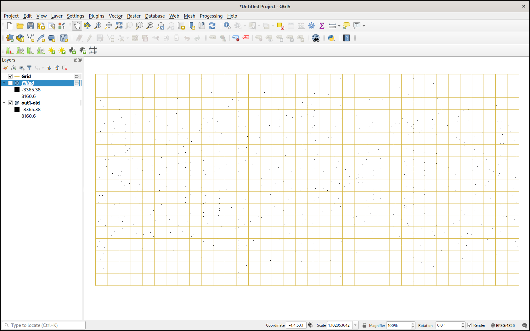
The resulting image was very large—just over 50 MB. It seems like a waste, given that most of the file just represents empty space, but it works.
By creating a lattice (using Vector -> Research Tools -> Create Grid...), it was clear that the image was aligned correctly. This is a major improvement over having to use the Georeferencer to align raster data.
The first thing I tried to do was create a contour map using Raster -> Extraction -> Contour.... But that didn’t do anything. I should have realized that what I was really asking it to do was to somehow interpolate the missing data and draw contours from it. This was far beyond the scope of the tool.
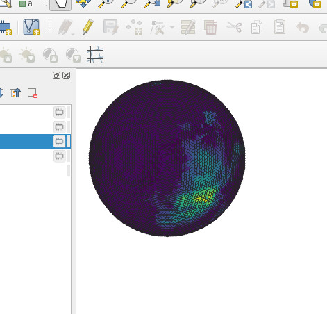
The next thing I did was ‘polygonize’ the map with the Raster -> Conversion -> Polygonize.... I wasn’t too surprised to see thousands of squares exactly where the raster data points were. But what I was surprised to see was that the elevation data was actually preserved in each square’s data attributes. This gave me an idea. I couldn’t do anything with the polygons, but when I used Vector -> Geometry Tools -> Centroids I had a point map. Then I took a gander at the layer’s symbology, and, after some fiddling, got it to display elevation based on a color ramp. If you zoom out far enough and view the project using an orthographic projection, it actually looks like a (scaly) heightmap.
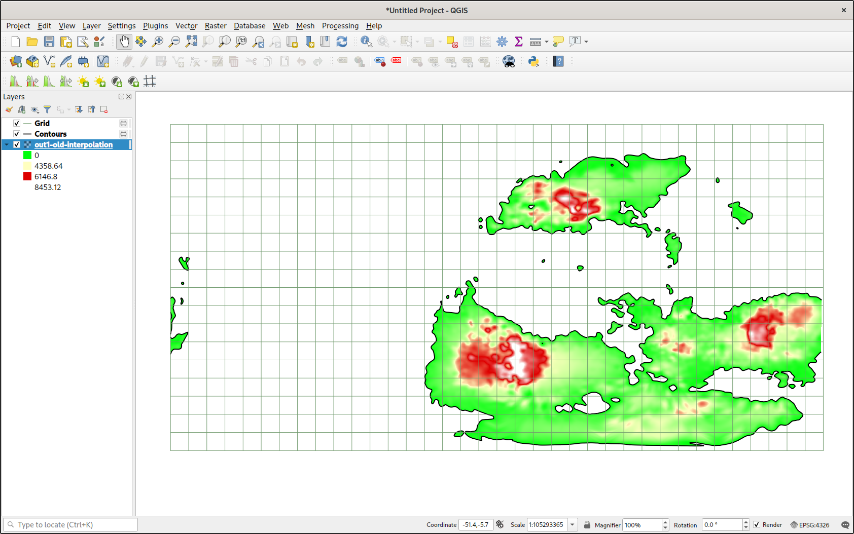
I tried the Raster -> Analysis -> Fill nodata feature. It filled in all the apparent gaps in my data using some kind of interpolation algorithm. I could actually see the entire planet. I was impressed, especially since it was so easy. I immediately created a contour map, and I was also impressed. I had a vector representation of all the major landmasses.
But, unfortunately, the interpolation in the Fill nodata tool is really basic. I would have to see if I could get better interpolation in Python.
Interpolation
I thought that interpolating data in Python would be trivial. Then I discovered the truth: it’s actually even easier than I thought.
I decided to use Griddata from Scipy’s interpolation library. The griddata() method made interpolation as easy as a single function call. All I needed were an list of points, an list of values corresponding to those points (I usually don’t like parallel arrays, but it makes sense here), and my selection of an interpolation method.
Things got tricky in specifying the points that I wanted to interpolate values at. The griddata() function is flexible on this parameter, and I’ve seen a variety of implementations. I didn’t really understand array broadcasting (I need to do some more work with vectorization), so I was confused at first. One particularly confusing implementation involved creating two arrays for the x and y axes with np.linspace(), then using ‘creative’ indexing to make them broadcastable.
xi = np.linspace(0, 3600, num=3600, endpoint=False)
yi = np.linspace(0, 1800, num=1800, endpoint=False)

data = griddata(locations, elevations, (xi[None,:], yi[:,None]), method='cubic')
Although this did work when I tried it, I hated this solution. So I used mgrid. But mgrid has its own quirks. For example, if you use mgrid with real number step lengths, then they are just step lengths, and the index is interpreted normally. But if you use complex numbers as your step length, it changes the entire interpretation of the index range. Firstly, the stop is inclusive. Secondly, the real component is interpreted as specifying the number of points on that axis. Honestly, I found this system to be entirely unintuitive, but whatever. I’m sure it makes sense to everyone but me.
# The two statements are equivalent
grid_x, grid_y = np.mgrid[0:3600:3601j, 0:1800:1801j]
# grid_x, grid_y = np.mgrid[0:3599:1, 0:1799:1]

# Create and fill parallel arrays of the data
locations = []
elevations = []
for row in reader:
lat = float(row[0]) if float(row[0]) < 90 else 89.9
lon = float(row[1]) if float(row[1]) < 180 else -180

y, x = trans(lat, lon)

locations.append([x, y])

elevations.append(float(row[2]))

data = griddata(locations, elevations, (grid_x, grid_y), method='cubic')
Once I ran griddata(), I had an array with the correct dimensions all ready to go. The results did not disappoint.
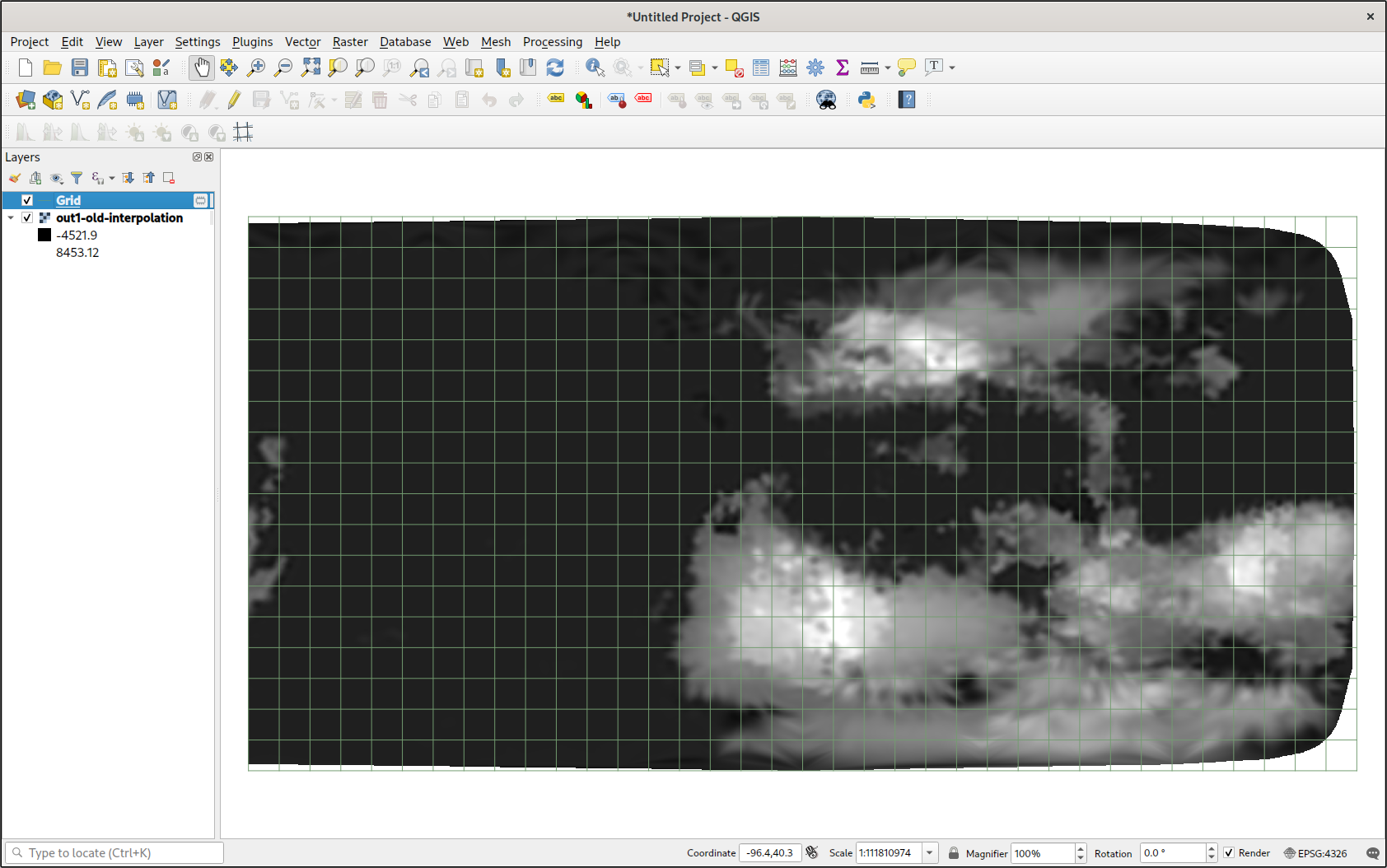
As you can see, I had a full heightmap at my disposal. When using cubic interpolation, there is an obvious gap around the convex hull of all the data points, but otherwise it was perfect. Editing the symbology, I made a better color ramp for the values. I could even cut off all values that were below sea level. Combined with a trace of the coastlines (from a contour map), the map looked pretty good.
Geopandas
There was only one problem: data around the poles looked terrible. This was not surprising, given that the interpolation algorithm doesn’t know it’s interpolating over a spherical surface rather than a flat one. But if I could interpolate over a map projection with less distortion over the poles, then I could better take advantage of my evenly sampled data. But I would have to transform tens of thousands of points. If only there were some library that I could use to quickly transform thousands of geographic coordinates to a projected coordinate system using something convenient, like a PROJ string.
Geopandas is an extension of the Pandas library made specially for GIS users. Among its many features is a special DataFrame column type designed to hold geographic coordinates, which can then be automatically transformed to a different coordinate system. It transforms coordinates so fast it must be accelerated, either using vectorization, Cython, or some other mechanism.
This is pretty straightforward. I’ve used Pandas to read CSV files before, and this wasn’t too difficult. Thanks to a blog post by Anita Graser, I found an elegant way to convert an ordinary DataFrame to a GeoDataFrame using DataFrame.drop() to drop the latitude and longitude columns, and a list comprehension create a geometry column from the original DataFrame.
columnnames = ['latitude', 'longitude', 'elevation', 'plate', 'temperature', 'precipitation']
data = pd.read_csv('molylaem-233My.csv', usecols=columnnames, header=None, names=columnnames)

data = gpd.GeoDataFrame(
data.drop(['latitude', 'longitude'], axis=1),
crs='+proj=latlong',
geometry=[Point(point) for point in zip(data.longitude, data.latitude)]
)
Then, converting to another coordinate system was as easy as one method.
data_ortho = data.to_crs('+proj=ortho +lat_0=-90')
I did have to ensure that points outside the projection’s area would not be counted. But that was as easy as a boolean index.
# remove points that aren't on the map
data_ortho = data_ortho[data_ortho['geometry'].x != np.inf]
data_ortho = data_ortho[data_ortho['geometry'].y != np.inf]
Results
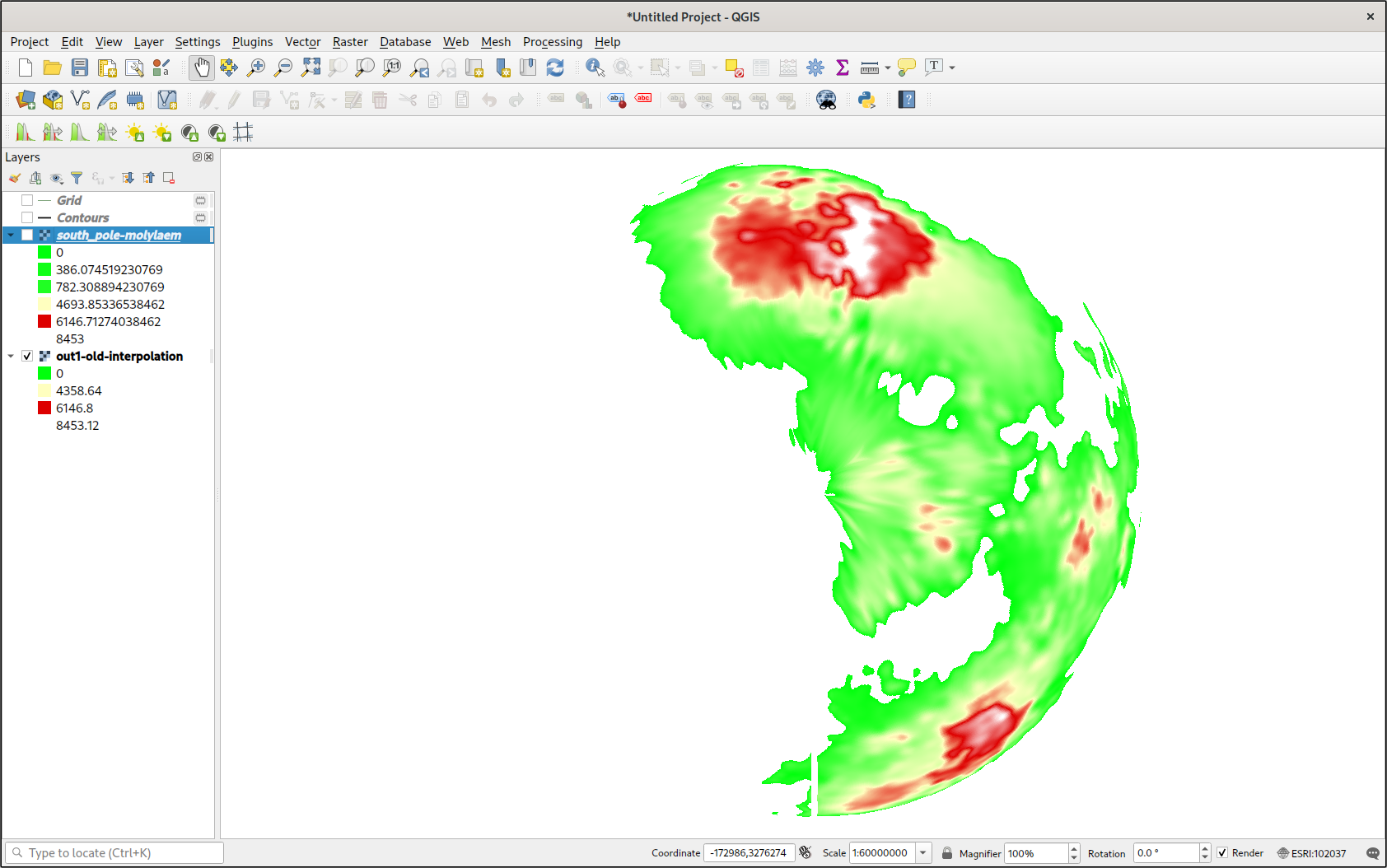
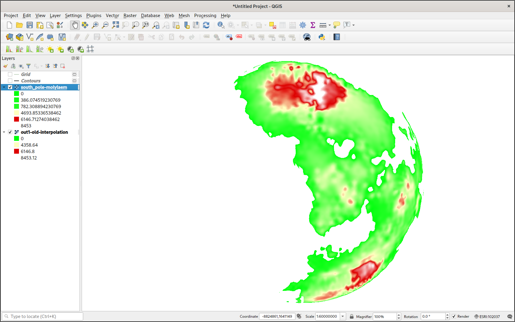
The results did not disappoint. Moreover, I could use this method to make a GeoTIFF of any projection around any area of my fictional planet. After all this work, I’ve barely even started.
Coda
The work documented in this article has allowed me to use Python tools and libraries to make use of exported data from TerraJ. This will be extremely helpful, as TerraJ implements many features that I require for realistic conworlding. In fact, there is much more data in TerraJ’s export files than just a digital elevation model. There is precipitation data, air pressure, and more. This will be extremely useful in the future.
But there is far more potential that even that. I could use these same techniques to generate GeoTIFFs from a variety of data sources. My own parallel-world project could benefit from this work. I could even manually edit data with image editing tools like Krita.
Acknowledgements
Thanks to all the developers who contributed to the free and open-source libraries used in this project. Thanks to everyone who contributed to the documentation for this software, especially the thorough example sections.